April 5, 2025

Year
2025
Client
Aqua-Tots Swim School
Category
Brand Identity, Design System, Collateral
Product Duration
4-5 Months
With over 175 locations around the world and over 50 million swim lessons taught since 1991, Aqua-Tots Swim School is one of the premier swim school brands on the planet. Their mission to serve communities and help parents raise safe and confident kids has brought them much success, but their brand visuals often didn't match the sterling reputation of the company.
Problem
Aqua-Tots Swim School lacked standardization across their channels, and mixed/inconsistent visuals muddled the brand's identity.
Solutions
Create and implement a comprehensive design system for Aqua-Tots to use across both digital and physical mediums, and settle on a visual style that owns the identity of the company being a trusted legacy brand that is in the business of teaching life-saving skills.
Scope
Conduct both internal and competition brand audits to find where Aqua-Tot's identity can merge with opportunities in the market, create brand design system including grids, social/digital/print templates, tiered iconography system, motion design, illustration guidelines and style, and new in-school graphics.
The new iconography would help Aqua-Tots internal design team move away from stock assets and into a more on-brand unique visual style. All icons were designed on a 50x50 pixel grid and with scalability in mind. Each has 3 variations; lo-fi, hi-fi, and motion. They are also designed with a consistent line-less style that carries over into the larger character illustrations.


Along with icons, badges were also designed for certain promotional series, along with 2 special variations of a 35-year anniversary badge to celebrate the brand's continued success from 1991-2026.

A design system comprised of "waves" implied through use of negative space and a new grid were used to create design templates for digital and print mediums. The grid waves allow Aqua-Tots internal design team the space to be creative with layouts and imply motion of the viewer's eye through the artboard, potentially guiding the audience to focal points or calls to action. An overall minimal design and heavy use of Aqua-Tots primary colors (navy, red, and white) implies credibility, order, and seeks to further build awareness for the brand. The consistent use of red rounded block lettering in headlines or cta's both teaches the viewer where to look and also further drives home the safety-focused identity.


While Aqua-Tots seeks to convey it's credibility as a legacy safety-first company to decision makers (parents & guardians) it also needs to walk the tightrope of having fun. Parents need to know that their kids will learn how to be safe in water when they attend swim school, but also that their kids will have fun. In the school and in marketing materials focused more on the child, illustrations using the level swim characters are used to bring out the fun side of the brand.

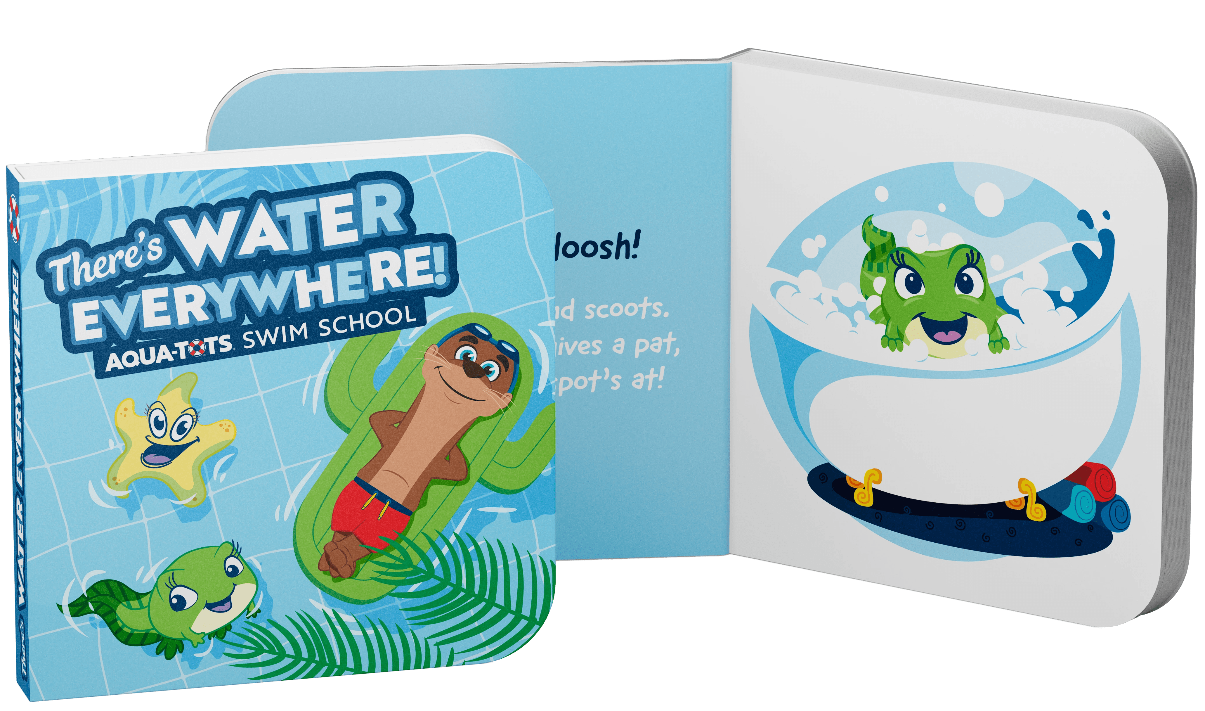
The level characters themselves remained the same, but with a new illustration style they are rendered with much more dimensionality and motion, moving them beyond rigid poses and allowing the Aqua-Tots internal team to have flexibility when placing them in a scene. While the level characters colors are more rainbow-focused, the new illustration style works to use more of the line-less style from the iconography, while working in use of the Aqua-Tots primary and secondary colors whenever possible.


